
Business inventory charts are essential tools for visualizing and interpreting crucial data within any business. Understanding how to create and interpret these charts allows businesses to gain valuable insights into inventory levels, turnover rates, and carrying costs, ultimately leading to better decision-making regarding purchasing, production, and sales forecasting. This guide explores various chart types, key metrics, design best practices, and advanced techniques for maximizing the effectiveness of business inventory charts.
From simple bar charts illustrating stock levels to sophisticated interactive dashboards displaying multiple metrics simultaneously, this exploration covers a range of techniques suitable for businesses of all sizes. We’ll delve into the nuances of each chart type, demonstrating how to choose the most effective visualization for specific scenarios. Furthermore, we’ll highlight the importance of clear design and data interpretation, emphasizing how to extract actionable insights that drive operational efficiency and profitability.
Types of Business Inventory Charts

Effective visualization of inventory data is crucial for informed decision-making in any business. Choosing the right chart type depends heavily on the specific data and the insights you aim to extract. Different chart types highlight different aspects of your inventory, allowing for a more comprehensive understanding.Different chart types offer unique advantages in representing inventory data. The choice depends on the specific information you want to highlight and the audience you’re presenting to.
Understanding these differences is key to effective inventory management.
Bar Charts for Comparing Inventory Levels
Bar charts are excellent for comparing inventory levels across different products, locations, or time periods. The length of each bar directly represents the quantity of a specific item. For example, a bar chart could effectively show the stock levels of various product lines at the end of a quarter, allowing for immediate comparison of which products are selling well and which may require attention.
A taller bar indicates a higher inventory level. This visual representation makes it easy to identify highs and lows at a glance. They are particularly useful when comparing discrete categories.
Line Charts for Tracking Inventory Trends
Line charts are ideal for illustrating inventory trends over time. They show the change in inventory levels over a continuous period, highlighting upward or downward movements. For instance, a line chart tracking the inventory of a particular product over a year would reveal seasonal fluctuations, sales trends, and potential stock-outs. The slope of the line indicates the rate of change—a steep incline shows rapid growth, while a decline indicates decreasing inventory.
Line charts excel at showing continuous data and revealing patterns over time.
Comparing Line and Bar Charts for Inventory Visualization
While both line and bar charts can display inventory levels, they serve different purposes. A bar chart is superior when comparing distinct categories at a single point in time, such as comparing the inventory levels of different products at the end of a month. A line chart, however, is more effective when tracking the change in inventory of a single item over time, such as monitoring the stock of a popular seasonal item throughout the year.
The choice between these two chart types depends on the specific analytical goal. If the focus is on comparing distinct categories, a bar chart is preferred. If the focus is on tracking trends over time, a line chart is more suitable.
Stacked Bar Charts for Multi-Category Inventory Analysis
Stacked bar charts are invaluable for displaying multiple inventory categories simultaneously within a single product or across different product lines. Each bar represents a total inventory level, with segments within the bar representing the different categories. For example, a stacked bar chart could show the total inventory of a specific product, broken down into its different sizes (small, medium, large).
The height of each segment within the bar indicates the quantity of that particular size. Interpreting such a chart involves comparing the relative heights of the segments within each bar and the overall height of the bars themselves to understand the proportion of each category within the total inventory and the total inventory levels across different products or time periods.
This provides a comprehensive view of inventory composition and overall stock levels.
Key Metrics Displayed in Inventory Charts
Effective inventory management relies heavily on the accurate tracking and analysis of key performance indicators (KPIs). Business inventory charts provide a visual representation of these metrics, allowing for quick identification of trends and areas needing attention. Understanding these metrics is crucial for optimizing inventory levels, reducing costs, and improving overall profitability.Inventory charts typically incorporate several essential metrics to offer a comprehensive view of inventory performance.
These metrics provide insights into various aspects of inventory management, from the quantity of goods on hand to the efficiency of inventory turnover and the associated costs.
Inventory Levels
Inventory levels represent the total quantity of goods available at a specific point in time. This metric is usually displayed as a line graph, showing the inventory quantity over a period (e.g., monthly, quarterly, or annually). A consistently high inventory level might indicate overstocking, while consistently low levels might suggest stockouts and lost sales opportunities. Fluctuations in inventory levels can be analyzed to identify seasonal demand patterns or the impact of promotional campaigns.
Inventory Turnover Rate, Business inventory charts
The inventory turnover rate measures how efficiently a business sells its inventory. A higher turnover rate generally indicates strong sales and efficient inventory management, while a low rate might suggest slow-moving inventory or overstocking. The calculation is straightforward:
Inventory Turnover Rate = Cost of Goods Sold / Average Inventory
The average inventory is calculated by summing the beginning and ending inventory values for a period and dividing by two. For example, if a company’s cost of goods sold for a year was $100,000 and the average inventory was $20,000, the inventory turnover rate would be 5. This means the company sold its entire inventory five times during the year.
This data can be visually represented in a bar chart, with each bar representing the turnover rate for a specific period. A line chart could also be used to track the turnover rate over time, highlighting trends and seasonal variations.
Carrying Costs
Carrying costs represent the expenses associated with holding inventory, including storage costs, insurance, taxes, obsolescence, and potential spoilage. These costs can be substantial and significantly impact profitability. Integrating carrying costs into an inventory chart provides a clear picture of the financial implications of inventory management decisions. A hypothetical chart could show carrying costs as a percentage of total inventory value over time.
For instance, if carrying costs consistently account for 20% of inventory value, this can be displayed as a separate line on the chart alongside inventory levels, immediately highlighting the financial burden of maintaining high inventory levels. For a company with $100,000 worth of inventory and 20% carrying costs, the chart would visually represent a $20,000 carrying cost. This visual representation facilitates a direct comparison between inventory levels and their associated financial impact, enabling better decision-making related to inventory optimization.
Interpreting Inventory Chart Data
Understanding inventory chart data is crucial for effective business management. By analyzing trends and patterns, businesses can make informed decisions regarding purchasing, production, and sales forecasting, ultimately optimizing inventory levels and minimizing costs. This section will explore various chart interpretations and their implications for business strategies.
Inventory charts visually represent the flow and status of a company’s inventory over time. Analyzing these charts reveals critical information about inventory levels, turnover rates, and potential bottlenecks. This allows businesses to identify areas for improvement, predict future needs, and proactively address potential issues before they impact profitability.
Increasing Inventory Levels
Rising inventory levels, as depicted by an upward trend on a chart, can indicate several scenarios. For instance, a sudden increase might reflect a successful marketing campaign leading to higher sales, but sustained growth without corresponding sales increases suggests overstocking. This could be due to inaccurate demand forecasting, excessive purchasing, or slow-moving products. The implications for business decisions include the need to review sales forecasts, optimize ordering processes, and potentially implement strategies to liquidate excess stock, such as sales promotions or discounts.
Declining Turnover Rate
A declining inventory turnover rate, which can be visually identified by a flattening or downward trend on a chart showing the ratio of cost of goods sold to average inventory, signifies that inventory is moving more slowly. This suggests potential issues such as obsolete stock, reduced demand for certain products, or inefficient inventory management. Businesses need to investigate the causes of slow turnover, potentially through market research or analysis of sales data.
Actions might include adjusting production schedules, implementing stricter inventory control measures, or offering discounts to stimulate sales.
Seasonal Inventory Fluctuations
Many businesses experience predictable seasonal fluctuations in inventory levels. For example, a retailer selling winter clothing might show a sharp increase in inventory levels during the fall months in preparation for the holiday season, followed by a decrease in the spring. Understanding these seasonal patterns is crucial for accurate forecasting. Businesses can use historical data to predict future demand and optimize inventory levels accordingly, minimizing storage costs during low seasons and ensuring sufficient stock during peak seasons.
A deviation from this established seasonal pattern may indicate a need to reassess market trends or adjust marketing strategies.
Identifying Potential Inventory Issues
Analyzing inventory charts allows for the identification of several potential problems. For example, a consistent pattern of stockouts for specific products points to a need for improved forecasting and ordering processes. Conversely, frequent instances of excess inventory might indicate over-ordering or inaccurate demand forecasting. Sharp, unexpected drops in inventory levels may signal theft or inaccurate record-keeping. These insights are vital for implementing corrective actions, such as refining forecasting models, enhancing security measures, or improving inventory tracking systems.
Advanced Inventory Charting Techniques
Advanced inventory charting moves beyond basic visualizations to provide deeper insights and facilitate data-driven decision-making. By incorporating forecasting models and interactive elements, businesses can gain a more comprehensive understanding of their inventory dynamics and optimize their stock management strategies.This section explores techniques that leverage the power of data visualization to enhance inventory management. We will examine how forecasting models can be visually represented, the benefits of interactive charts, and the design of effective inventory dashboards.
Visualizing Inventory Forecasting Models and Accuracy
Inventory forecasting models, such as moving averages or exponential smoothing, predict future inventory needs. Visualizing these predictions alongside actual inventory levels allows for a clear assessment of model accuracy. For example, consider a hypothetical scenario where a retailer uses a simple moving average to forecast demand for a popular winter coat. The chart would display the predicted demand (a line graph representing the moving average forecast) alongside the actual sales data (a bar chart showing sales for each period).
The difference between the predicted and actual values visually represents the forecasting error. A chart showing consistently close alignment between predicted and actual sales indicates a highly accurate forecasting model. Conversely, significant discrepancies would highlight areas needing model refinement or a shift in forecasting methodology. The chart itself could employ color-coding: green for periods with low forecasting error, yellow for moderate error, and red for high error.
This visual cue immediately highlights areas where adjustments to the forecasting model are necessary.
Interactive Inventory Charts and Their Features
Interactive inventory charts empower users to explore data dynamically. Key features include zooming and panning to examine specific time periods or product categories in detail. Data filtering allows users to isolate specific products or time ranges for focused analysis. Drill-down capabilities enable users to access more granular data, for instance, moving from a summary view of total inventory to a detailed breakdown by warehouse location or product SKU.
Interactive charts often incorporate user-defined thresholds, highlighting when inventory levels fall below minimum stock or exceed maximum storage capacity. This visual cue immediately alerts users to potential stockouts or overstocking situations, allowing for prompt action. Further functionality could include dynamic comparisons, allowing users to compare current inventory levels to historical data or forecasts.
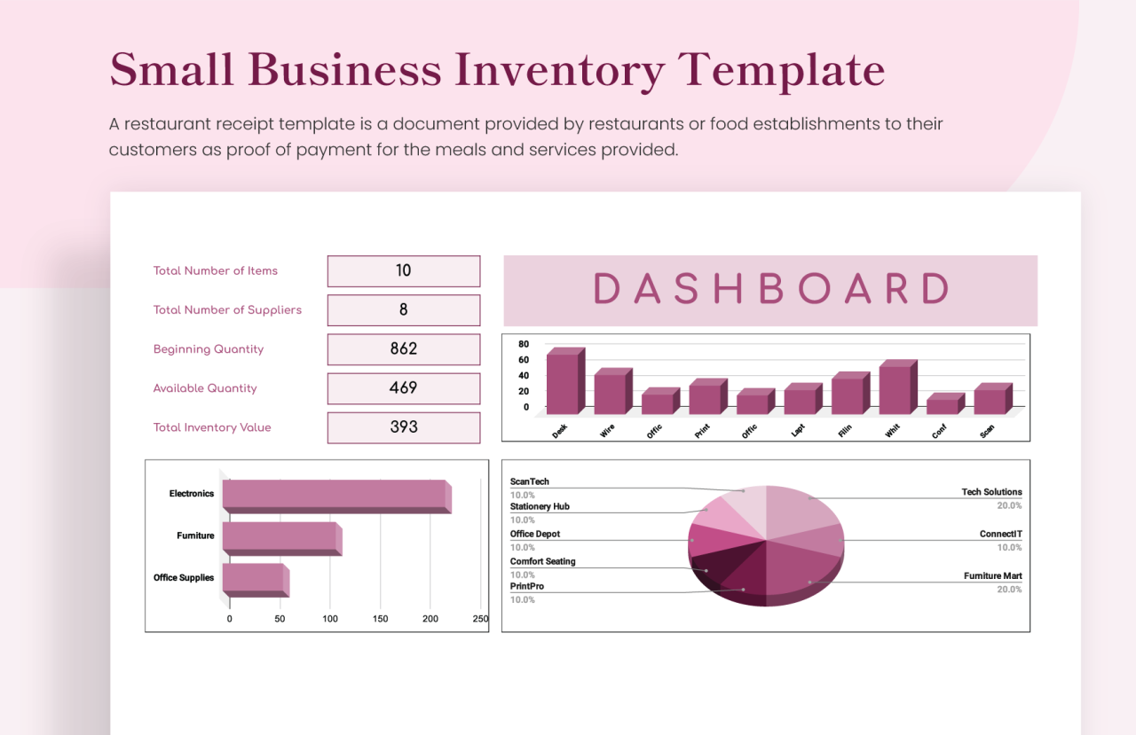
Inventory Dashboard Design
An effective inventory dashboard integrates multiple charts to provide a holistic overview. Imagine a dashboard with four key areas: The top-left quadrant displays a line graph showing overall inventory value over time, highlighting trends and seasonality. The top-right quadrant presents a bar chart comparing inventory levels across different product categories. The bottom-left quadrant features a geographic map displaying inventory distribution across various warehouses or distribution centers, using color-coding to represent inventory levels in each location.
Finally, the bottom-right quadrant shows a series of smaller charts, perhaps pie charts representing inventory turnover rates by product category and a table summarizing key performance indicators (KPIs) like average inventory holding costs or stockout rates. This comprehensive view allows users to quickly grasp the overall inventory situation, identify potential problems, and make informed decisions.
Final Wrap-Up
Mastering the art of business inventory charting empowers businesses to move beyond simple data recording and into a realm of proactive decision-making. By effectively visualizing key metrics and understanding underlying trends, companies can optimize inventory levels, reduce carrying costs, and improve forecasting accuracy. The ability to quickly identify potential problems and opportunities through insightful data visualization provides a competitive edge in today’s dynamic market.
This guide serves as a foundational resource for anyone seeking to leverage the power of visual data analysis in inventory management.
Helpful Answers
What software can I use to create business inventory charts?
Many options exist, including spreadsheet software like Microsoft Excel or Google Sheets, dedicated business intelligence tools, and data visualization platforms such as Tableau or Power BI.
How frequently should I update my inventory charts?
The frequency depends on your business’s needs and inventory turnover rate. Daily updates might be necessary for fast-moving goods, while weekly or monthly updates may suffice for slower-moving items.
How can I ensure my charts are accessible to all stakeholders?
Use clear and concise labels, avoid overly complex designs, and consider providing data in alternative formats (e.g., tables) for those who may find visual representations challenging.